.svg)
%201.svg)

담당자가 프로모션 코드를 발송해 드립니다.
와탭을 경험해 보세요.
와탭을 경험해 보세요.
와탭을 경험해 보세요.
와탭을 경험해 보세요.
와탭을 경험해 보세요.
와탭을 경험해 보세요.
와탭을 경험해 보세요.
와탭을 경험해 보세요.
WhaTap AI를 경험해 보세요.
What an Average of 136 Doesn't Tell You: Monitoring's Blind Spots Through CGM Data
.webp)
This is a story about health management — and, at the same time, a story about system operations.
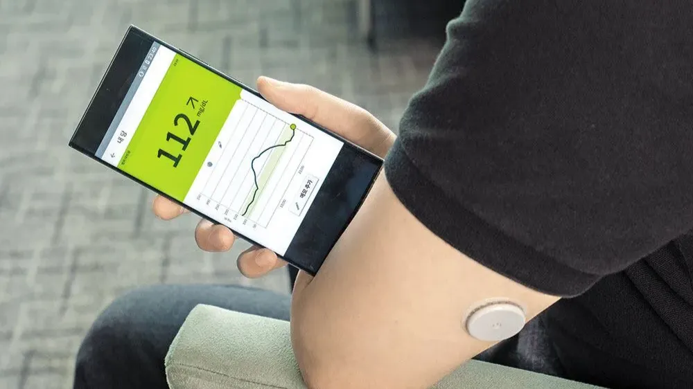
I recently wore a CGM (Continuous Glucose Monitor) and recorded my data over the course of four days. It started out of simple curiosity about my health, but as I dug into the graphs, I stumbled onto something entirely different: just how much an average can hide, and how the act of making something visible can fundamentally change behavior.
If you're considering adopting a monitoring system, or if you're running one that "looks fine on paper" yet keeps producing unexplained issues — this might resonate.
What Is a CGM, and Why Did I Try One?
A CGM is a device that attaches a sensor to the skin and continuously measures blood glucose levels. While a traditional blood glucose test gives you a snapshot at a single point in time, a CGM shows you how your glucose fluctuates throughout the entire day, rendered as a continuous graph.
Even if you're not diabetic, most people have no real understanding of their glucose patterns. We rely on gut feeling to judge our health. Feeling tired? "Rough day." Drowsy after a meal? "Just a food coma." I tried a CGM for a simple reason: I wanted to see how well those gut feelings matched the actual data.
Days 1–2: The Averages Looked Fine

On March 30 — the first day — my average blood glucose was 136. On the 31st, it was 129. By the numbers alone, these seem perfectly acceptable. Generally, a fasting glucose between 100 and 125 falls into the "caution" category, and some post-meal rise is a completely normal response.
But the shape of the graph told a completely different story.
On the 30th, there were three distinct spikes throughout the day, each climbing close to 250 mg/dL before dropping sharply. On the 31st, there was a single spike after lunch — but the climb was even steeper and the drop faster, sending my levels down near the hypoglycemia threshold (the red dashed line).
After each spike, fatigue and loss of focus were unmistakable. Before, I would have dismissed this as a "food coma." But once I saw the graph, I started interpreting it differently. My body was genuinely reacting to these rapid rises and falls in glucose.
In the end, the number "average 136" explains none of this variability.
Days 3–4: A Change in Eating Patterns Changed the Graph

After reviewing two days of data, I made a few adjustments. I changed the order of my meals — eating vegetables and protein first, carbohydrates last — and spaced my meals further apart. Nothing extreme. Just small tweaks.
On April 1st, my average was 137 — virtually identical to before — but the shape of the spikes began to change. Instead of sharp surges followed by steep drops, the curves became more gradual: a gentler rise, a gentler fall.
April 2nd made it even clearer. My average glucose was 131, actually higher than the 129 on the 31st. Yet the overall graph looked far more stable. The spike heights were lower, the sharp drops were gone, and the entire curve flowed smoothly. The post-meal fatigue dropped noticeably as well.
Four days of data was all it took to confirm firsthand: the same average can represent completely different states.
What Averages Hide — The Same Trap Exists in System Operations
The most striking takeaway from this experience wasn't a number — it was a pattern. My average blood glucose barely changed across all four days, yet my actual condition was different every single day.
This same dynamic plays out in system operations.
Take an average CPU utilization of 40% and an average response time of 200ms. On the surface, everything looks stable. But you have no idea what's happening behind that average. Sudden load spikes concentrated in specific time windows, short but recurring latency spikes, errors that don't surface in dashboards but keep accumulating — these all get smoothed away by the average.
Averages are a useful metric. But averages alone cannot explain variability. And in practice, most outages and long-term performance degradation don't start with a bad average — they start with this kind of variability.

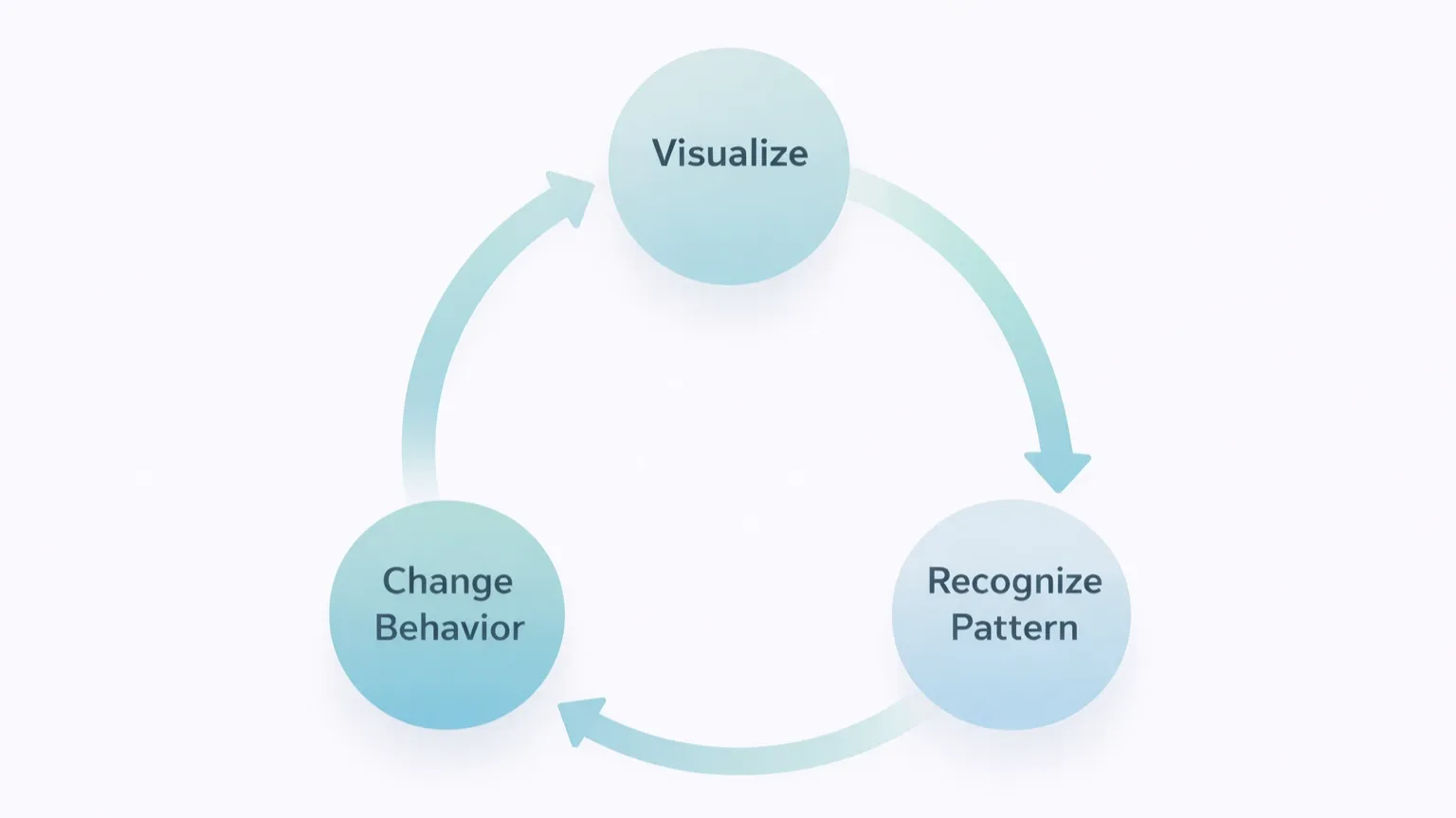
Data Changes Behavior — Not Willpower, but Visibility
What fascinated me most about these four days was how the change happened.
I didn't change my eating habits because I made some grand resolution to "get healthier." I changed them because the graph was right there in front of me. Once I could see which meals caused which spikes, my decision-making criteria shifted on their own. It wasn't about forcing myself to resist — it was that the outcomes became predictable, so different choices just made sense.
The same principle applies to system operations. The difference between a team that reacts only after an alert fires and a team that intervenes as soon as anomalous patterns begin to emerge ultimately comes down to how much they can see. It's less about the capability of the tool, and more about what the tool lets you observe.
What Is Your Monitoring Missing?
The conclusion from this CGM experiment is clear: continuous patterns of change provide far more information than average values. And once those patterns become visible, behavior naturally follows.
The same is true for system monitoring. If the dashboard you're looking at only shows averages and point-in-time snapshots, there are still blind spots.
- Not static values — but how things change over time
- Not averages — but distributions and outliers
- Not isolated events — but recurring patterns
Just as managing blood glucose requires a CGM, understanding the patterns in your systems requires an environment that continuously collects data and tracks how it evolves. There is a world of difference between logs simply piling up and meaningful patterns actually becoming visible.
I work in system monitoring, so this analogy probably hit closer to home for me than it might for most. At WhaTap, we focus on collecting continuous performance data — from the browser, to the application, to the server and database, spanning frontend to backend — and detecting anomalous patterns in real time, rather than relying on averages.
Just as a CGM visualizes blood glucose spikes on a graph, WhaTap visualizes changes like traffic surges, response time anomalies, and error patterns. If you're considering adopting a monitoring tool, trying WhaTap firsthand could be a worthwhile option.


.webp)